With the latest changes of Google, which has come to consider having a mobile version of the web as a factor to be taken into account to better position in the results of searches made from mobile devices, being able to check the quality of the same has become very important.
To find out if your site is really ready for mobile devices, both from Google’s point of view and from the point of view of usability, you have at your disposal several free tools. We highlight five of them:
- Mobile-Friendly Test: To check page-by-page optimization for Google on an individual basis.
- Mobile Usability Report in Search Console [Webmaster Tools]: To check if the ENTIRE website is optimized according to Google.
- Mobile Friendly CheckerTo know to what degree the individual pages are NOT adapted to Google.
- PageSpeed Insights: Check page loading speed, both for mobile and desktop devices.
- Chrome Developer Tool – Device Mode: Mobile device emulator.
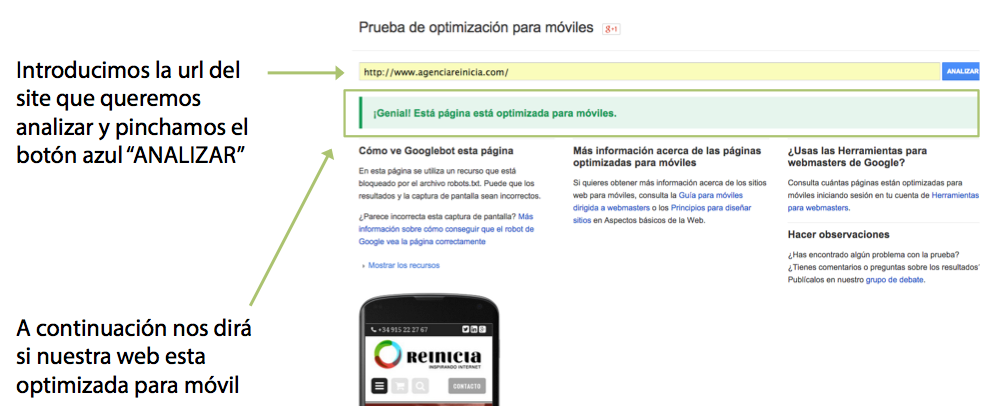
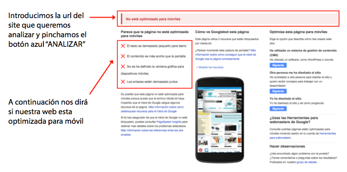
Mobile-Friendly Test
Free tool to find out if a website is optimized for mobile according to five criteria that are important for Google.
- Indicates whether or not a SITE PAGE is adapted or not adapted
- Test page by page
- Test ONLY 5 factors that Google considers most relevant
Important: Test Templates. Home page, product list, product sheet, etc. One at a time. A website of less than 100 pages usually consists of about 10 templates.
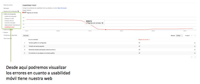
Search Console [Former Webmaster Tools].
It is the Google tool that allows you to monitor and maintain the presence of a website in Google search results.
- It is free of charge
- Up to 1,000 sites can be managed
- They must be added voluntarily. Being in Google results does not depend on it.
- The ownership of the added sites must be verified.
Mobile-Friendly Checker for Google Chrome
A tool installed in the Chrome browser that automatically evaluates numerically the mobile optimization of the pages you visit. Used in conjunction with Google’s Mobile-Friendly Test tool, it will help you to have more details of the errors to correct. Once installed, a mobile icon will appear at the top right of the browser and you will only have to click on it to display the details of the analysis performed for the page you are on. Please note that the analysis may take up to 30 seconds, so the score may take some time to appear:
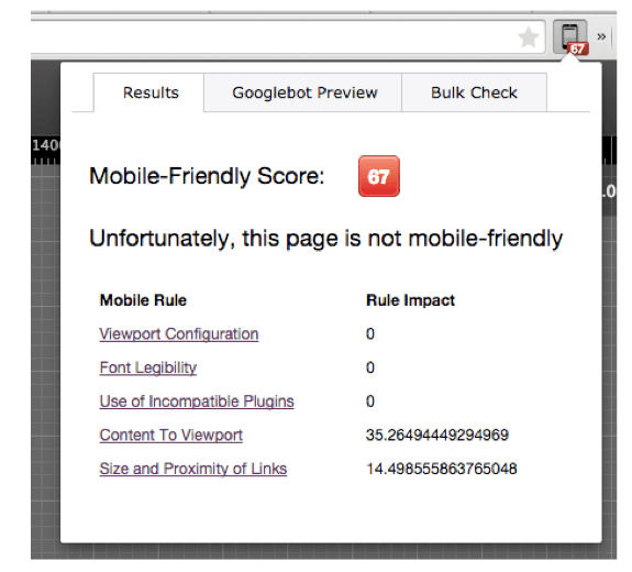
Some questions to take into account in order to correctly analyze the data that will be shown to you:
- Indicates an overall numerical value of mobile optimization: 0 very bad and 100 perfect.
- To pass the “mobile-friendly test”, you must be over 80
- The total value is NOT equal to the sum of the individual values minus 100. There is a specific weight for each factor. If you notice, in the example just above, negative 35.26 points are assigned to “Content To Viewport” and 14.49 to “Size and Proximity of Links”, but adding those values and subtracting them from 100, the value is NOT 67 as shown, but 50.
- Each of the five Google factors is assigned a maximum number of points.
- It may give small errors that are NOT indicated in the “Friendly-Mobile Test”.
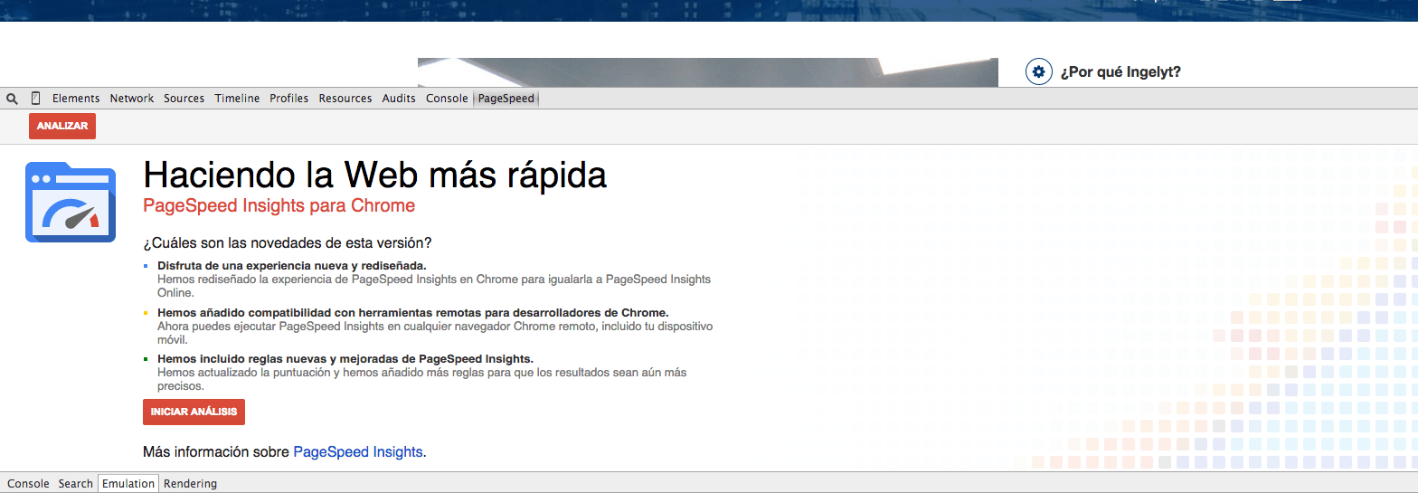
PageSpeed Insights
Measures page performance in terms of loading time for mobile devices and for computers. Its basic characteristics are as follows:
- Get the URL twice, once with a mobile user agent, and once with a desktop user agent.
- PageSpeed scores range from 0 to 100 points. The higher the better.
- Measures improved page performance on the following factors:
- Loading time in the top half of the page: This part of the pages is what Google gives the most importance to when measuring load speed.
- Full page load time
- It only takes into account non-network performance aspects: server configuration, HTML structure of the page and use of external resources such as images, JavaScript and CSS.
It can be used by two different means:
1. Google” extension Chrome“
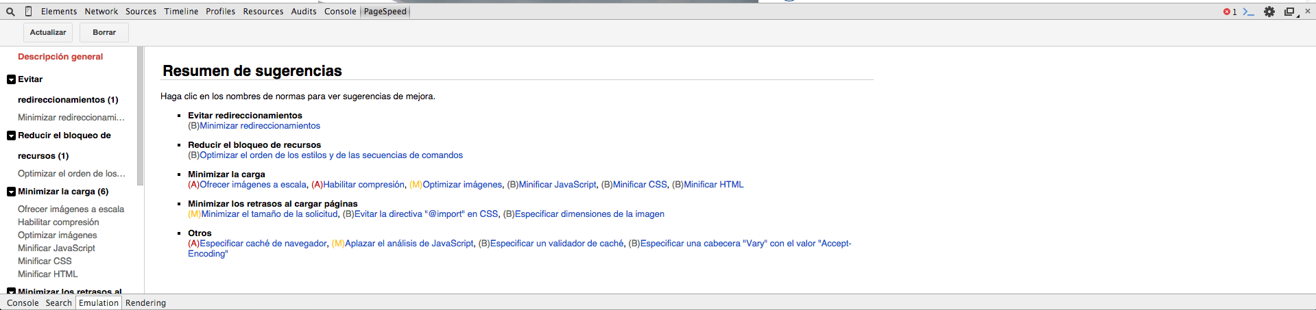
By default installed in the browser: Menu > Developer Tools > “PageSpeed” tab. Just click on the “Analyze” button once you have navigated to the page you want to evaluate and in a few seconds you will have the suggestions:
If you want to use it from the web version, you will have to access the tool page and enter the URL you want to analyze:

Developer Tool – Device Mode
It is a tool available by default in Google Chrome that allows us to emulate the navigation of any web from a mobile device. It should be accessed by following the path “Menu > More developer tools > Devide Mode”. When you open it, a window like the one shown below will be loaded:
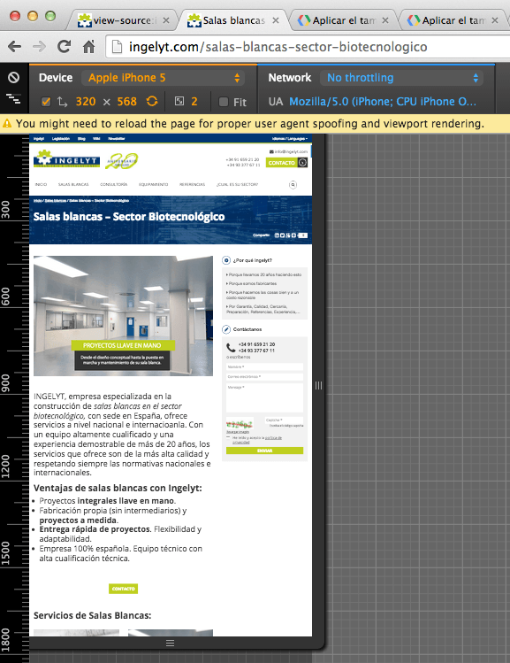
When opened, the following web browsing features will be activated:
- Mark the User Agent
- Screen resolution and pixel ratio
- Activates touch emulation
- Emulates mobile scrollbar and viewport
- Automatically sets text sizes for pages without the viewport
With this tool, you will be able to test the web you want as if you were browsing it from a mobile device. Its most important features are:
- Pointer measures 20px * 20px
- Allows you to view the web simulating different devices and connections.
- Allows to simulate different connection networks
- View with the device in portrait and landscape
- Testing with the different CSS Media Query jumps
- Adjust the window to the specific size we are interested in, even if we do not have the device.
- It can be adjusted to the available screen space.