On April 21, a new change in Google’s algorithm was launched, which will make having a website adapted to mobile devices a factor to be taken into account for positioning in the search engine whenever a user searches from a mobile device. What does this mean? If you have a website adapted to mobile devices, your results for searches from these devices may be better and if you don’t, it is likely to get worse, although this is NOT certain.
The main points to note about this latest change are that:
- Only mobile searches are affected. Results performed from desktop or tablet computers are NOT affected.
- When we talk about mobile, we are NOT talking about tablets. Searches from tablets will still show the same search results as those shown when searching from a desktop computer.
- It is for all languages.
- It is a change that applies to individual pages, not the entire site. This means that if you have 10 pages that are adapted and 5 that are not, the 10 that are adapted YES are likely to improve and the 5 that are not are likely to get worse.
In any case, this new factor is one more in a bag of more than 100 factors where the users’ search intent is still a very strong signal, so if Google considers that your page is relevant to the search performed by the User and has a high quality, it could also continue to show it even if it is not adapted to mobile browsing. The only visible difference is that it will NOT have the “For mobile” indicator: in the search results.

Why this change by Google?
With more than 50% of Google searches conducted from mobile devices in more than 10 countries, including the US and Japan, according to the company itself, it’s no wonder Google is putting the focus on improving the experience for people browsing from smartphones. If you don’t have a mobile website, do the math, because you’ll be missing out on converting for half of the users who come to your site from Google.
If we add to this the fact that mobile searches have a higher purchase intent and that they convert in many sectors almost immediately, it is a fact to be taken into account. Especially in local searches, in which, according to a study by “Telmetrics”, 78% end up making a purchase.
According to another study by Search Engine Land, for transactions related to the restaurant and entertainment sectors in the United States, the search-to-purchase cycle is even longer than in other sectors, with 64% and 51%, respectively, of people completing their purchase within an hour of searching. They also highlight the importance of proximity, with 52% of consumers searching on mobile wanting a location within 5 miles. These users are looking for information regarding locations, prices, reviews and contact/phone information that is clear as what these users are looking for most. In fact, when it comes to contacting a business, 53% of mobile users make a call.
Therefore, this algorithm update is the natural result of how the use of the Internet in general and Google in particular by people is evolving and was announced by a series of improvements that the search engine had introduced in recent months with the aim of improving the search results offered to all those who connect from cell phones. Some of these changes are:
- Enhancements to ensure that a site is properly configured for cell phones
- Enhancements to ensure that a site looks good on cell phones
- Content results for those applications in which you are logged in when searching from your cell phone.
- Google Adwords has incorporated a multitude of improvements aimed at providing advertisers with better tools for advertising on mobile devices.
- It has incorporated in Webmaster Tools a “Mobile Usability” section where it informs webmasters of possible incidents in relation to the visualization on smartphones.
- Changes in mobile search results, replacing URLs with the actual domain name, brand name, and URL structure in breadcrumbs mode. https://googlewebmastercentral.blogspot.ca/2015/04/better-presentation-of-urls-in-search.html?utm_source=feedburner&utm_medium=feed&utm_campaign=Feed:+blogspot/amDG+(Official+Google+Webmaster+Central+Blog)
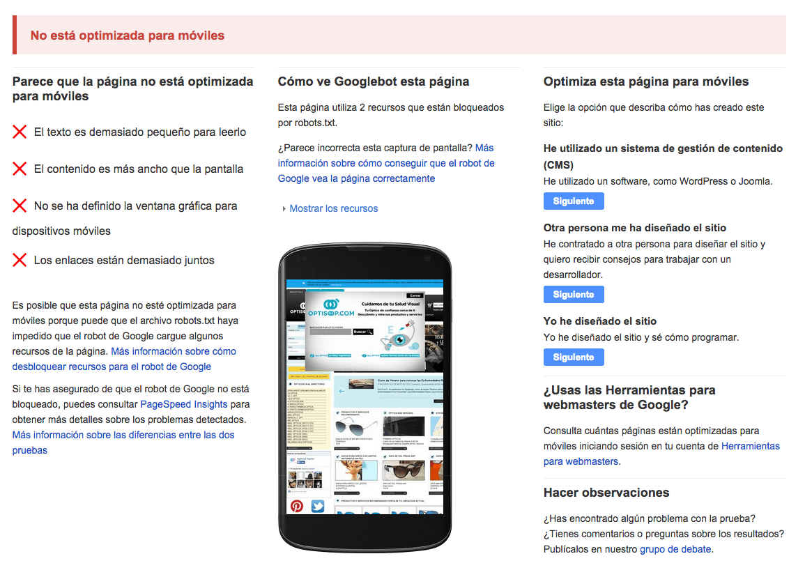
Where can you check if your website is mobile-friendly according to Google?
By now, you may be wondering if this change will have affected you and what you should do to take advantage of it as an opportunity and not consider it a threat. The answer is simple: Make sure your website is accessible from mobile devices!!! And we do not mean that everything looks smaller like what we show below:
Rather, the web elements should change their layout, be displayed in a different way or be hidden so that browsing through the mobile is pleasant for the user and does not become a hellish experience.
In order to check if your site is really prepared for mobile devices from Google’s point of view, you have different tools at your disposal. These are the ones we use at the agency:
- Mobile-Friendly Test: To check page by page individually.
- Mobile Usability Report in Webmaster Tools: To see the complete site.
- PageSpeed Insights: Through an extension in Google Chrome, it allows you to analyze individual pages of a website.
- Mobile Friendly Checker: Another Google Chrome extension that allows us to analyze the pages we browse.
- Mass URL Mobile Analyzer: A small web application that allows you to check multiple URLs at the same time.
Each of them has some functionality that characterizes them. We will explain them in a separate article later on.
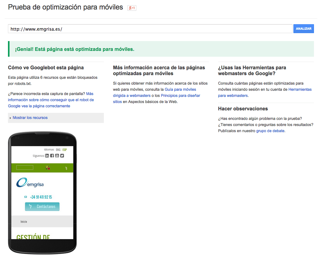
As a quick way, go to the testing tool that Google has enabled, the first one in the list above, and enter the main URL of your domain in the form box. The result is binary, i.e. the page will be considered as mobile [“Great! This page is optimized for mobile”] or not [“Not optimized for mobile”], but there will NOT be different degrees of “mobile”, at least for the moment:
What are the technical alternatives for a mobile site?
In case you get any errors, before getting down to work to revamp your website, the first thing you need to know is what technical alternatives you have to implement a mobile version of your website. We tell you briefly below and give you pros and cons for each one from different points of view:
| Mobile Configuration | Invariable URL? | Invariant HTML code? |
| Responsive web design | YES | YES |
| Dynamic publication | YES | NO |
| Independent designs | NO | NO |
| Mobile App | – | – |
- Responsive web design: provides the same HTML code at the same URL regardless of the user’s device (computer, tablet, mobile or non-visual browser), but can process the presentation differently (i.e. “respond”) depending on the screen size.
- Dynamic publishing: Uses the same URL regardless of device, but generates a different version of the HTML code for different device types based on what the server knows about the user’s browser.
- Separate URLs: provides different code for each device and in separate URLs. In this configuration, each desktop URL has an equivalent URL that provides mobile-optimized content. It attempts to detect the users’ device and then redirects to the corresponding page using HTTP redirects together with the Vary: HTTP header. A common configuration example is as follows: pages from “www.example.com” are shown to computer users and equivalent pages from “m.example.com” are shown to mobile users.
- Mobile App: The web as a mobile application that is saved in the Users’ device.
| Mobile Configuration | Advantages | Disadvantages |
| Responsive web design |
|
|
| Dynamic publication |
|
|
| Independent designs |
|
|
| Mobile App |
|
|
Once you have chosen the type of configuration for your site, the important thing is to inform Google. Here are some small technical peculiarities to take into account for each of the technical alternatives extracted from the search engine’s own help:
- Responsive web design:
- Use the viewport and pictures tag in the HTML to facilitate a correct presentation on mobile devices. Google will know this way that it is in front of a “responsive” design. Any web designer will know how to do this without any problems.
<code><meta name=”viewport” content=”width=device-width, initial-scale=1.0″></code>
- Check the “robots.txt” file of your website and make sure that all Googlebot user agents have permission to crawl the page and its elements (CSS, JavaScript and images).
- Dynamic publication:
- The Vary HTTP header must be used to inform the browser that the content of the response will vary depending on the user agent requesting the page. If the server already uses the Vary HTTP header, you can add “User-Agent” to the list already provided.
- Make sure that you properly detect the different user agents and keep the list constantly updated. In this last one you usually fail quite a lot.
- DO NOT try to detect the Google bot user agent as “Googlebot”, because it identifies itself as a mobile device. On Google’ s website you can find the user agent with which it identifies itself at any time.
- Independent URLs
- Detects user agent strings and redirects correctly
- Signals the relationship between two URLs with a tag that includes the elements rel=”canonical” and rel=”alternate”.
- On the desktop page, add a special rel=”alternate” link tag pointing to the corresponding mobile URL. This helps Googlebot detect the location of your site’s mobile pages.
- On the mobile page, add a rel=”canonical” link tag pointing to the corresponding desktop URL.
- Mobile App
-
- Google has recently incorporated the possibility for its robot to access certain contents of mobile applications and to show us contents of those applications in which we are logged in on our mobile device when performing a search.
- To do this, you need to add deep linking support and define the relationship of your web pages to the contents of the mobile application.
What factors does Google value in its mobile testing tool?
The tool that Google has made available to us analyzes each page individually, NOT a complete site. This is very important to keep in mind, because we will have to insert page by page [URL] if we want to know if they present problems for Google. In any case, the adaptation of a website to mobile is done on the basis of templates, so it is not necessary to test all the pages. It will be enough to test one page for each different template. For example: home page, a list of products, a product / service sheet, etc.
Similarly, before proceeding, it is important to know that Google does not give clear guidelines in its tool, but takes you to help sections where they speak generically of the possible problems that a website has. What we put below are conclusions that we have reached based on the information that Google has posted on the “Web Design Fundamentals” site and in its help for “PageSpeed Insights”. The factors are as follows:
- Font size
Google recommends a default size of 16px CSS for the font. However, each typography has its own characteristics: size, interlettering, etc, so it will have to be taken into account, as well as the characteristics of the device, which depending on the resolution, could show it smaller or larger.
- Distance between links
This rule is triggered when PageSpeed Insights detects that certain touch elements (such as buttons, links or form fields) may be too small or too close together, preventing the user from easily touching them on a touch screen.
Google, in its Android guidelines, recommends 48 CSS pixels high and wide, assuming the viewport is set up correctly. Links that are used less can be smaller, but should still be far enough apart so that a 10 mm fingertip does not mistakenly touch other links at the same time. Users should not have to zoom in (or rely on other browser interface features, such as Chrome’s magnifying glass) to easily and accurately press the desired button or link.
These include the elements most frequently used by users, such as buttons for frequently used actions, search bars, the most important form fields and the main navigation links.
It is normal for links or less frequently used buttons to be smaller than the recommended size (7 mm), but there should be no other touch elements within 5 mm (32 CSS pixels). This way, the user will not touch other elements by mistake.
- Definition of graphic window for mobile devices [viewport].
This only applies in cases where we have opted for a responsive web design. As mentioned above, Google has to detect the “viewport” meta tag to consider it correct.
- Content is wider than the screen
It is common in sites where the Mobile First is not properly worked that content, images or videos that protrude from the size of the screen appear. This is something that must be taken care of. In Google Webmaster Tools (Search Traffic > Mobile Usability > The content does not adapt to the graphic window) you have a report on all the pages that have this problem.
- Page load time
According to Google, any wait time longer than 1 second causes the person to lose the thread and the user experience to be sub-optimal. However, this is a difficult milestone to achieve, so you have to be a bit more reasonable. The best thing to do is to use Google’s PageSpeed Insights tool to correct the different response times for loading a website, since your website may respond well in some aspects and poorly in others.