In this post we are going to give you the guidelines on how to create a customized report according to the needs or requirements of your business...so here we go.
One thing we should know before we continue reading this post is that in Google Analytics there are two types of reports from the point of view of who creates them that are:
- Standard reports: these are the ones that are already created and configured by default.
- Customized reports: these are the ones we create in order to have all the necessary information for our specific business.
What are customized reports?
This is the first question that all of us who are dedicated to marketing and more specifically to web analytics have asked ourselves at some point in our lives. Google Analytics custom reports are custom templates that we can create ourselves with the dimensions and metrics that interest us in order to make our work much faster and easier when analyzing data.
For those who still do not know at this point the custom reports have their own tab in the main menu bar as we show below where you can view them.
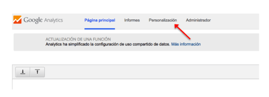
From this tab we can start to create it, but this is a step that we will see later, do not despair, the rush is not good. Now just stay with the place where you will have to go to start the process.
What is a customized report for?
The main purpose for which the custom reports were created is to give us all the information that we have spread throughout the standard Google Analytics reports, allowing us to spend much less time analyzing the entire account and therefore optimize our valuable time.
One of the main advantages of both standard and customized reports is that they allow us to communicate and report to the client quickly and easily.
Steps to follow to create a customized report
The time has come…
Here are the steps to follow to successfully generate your own customized report
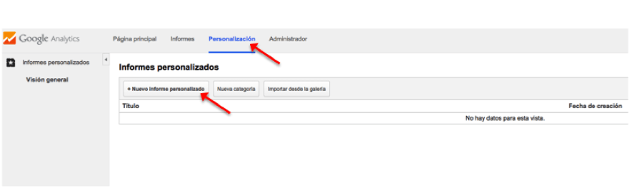
Step 1. New custom report: Once we have accessed the tab, we click on new custom report
Step 2. Create a custom report: when we get to this page we should follow the next steps:
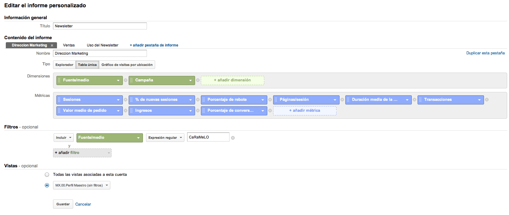
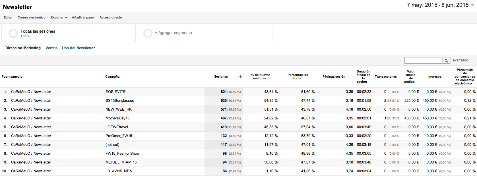
Note: We are going to describe each of the steps based on a customized Newsletter report.
- General information: We must give a title to the report we are creating. It is important that it clearly describes what the report is about, so that anyone can know it and not only us. In our case, we will put “Newsletter”.
- In report content: Here the first thing to do is to name the main tab. For example, Address.
- Add report tab: this is optional. Several tabs can be added to the report, so that each one has different dimensions and metrics aimed at a different audience. For example, the management will want to have more executive information on results, while a person in a more operational position will also want to know in detail how the Newsletter is being used.
- In Type, we select the “Explorer” option (this consists of a hierarchy of data tables linked by clickable rows), we must take into account that if we select this option the maximum number of metrics that we can include are 10 and 5 dimensions. In case we select the Single Tableoption (static tablethat allows to sort the data by criteria and shows the data in rows) with this option we can select up to 25 metrics and 5 dimensions and in case we select Chart of visits by location we will be shown different regions and countries and we will be indicated by colors the volume of traffic and interaction that exists.
- Metrics group: we select the metrics we want to analyze, as many as we want. In our case we have made a selection of the most important metrics for management: sessions [number of visits from the Newsletter], % new sessions [of total sessions, how many are new], bounce rate [of total visits, how many see only one page and leave], pages / session [average number of pages visited. It helps us to know the interest of newsletter users. The more pages, in general, the more interest], average session duration [in relation to the above], transactions [sales made to newsletter campaign visitors], average order value, revenue and conversion rate [percentage of visits that purchase]..
- Dimensions: as with the group of metrics, we will select the dimensions we need to analyze. We have to take into account that in the option Visits by location graph this option is not available. In our case we have selected the following dimensions: source / medium [where the visits come from. In this case, we want to analyze only the newsletter visits, so we will put a filter related to this dimension] and campaign [the name of the newsletter sent. It will help us to know which mailings generated more interest and/or sales]..
- Filter: this is optional and we will only use it if we want to limit the report to a specific subset of data. In the example report we have filtered by a term that includes all the newsletter campaigns, so that they do not get mixed up with other campaigns that we may have run.
Once this is done we click on Save and as a great chef would say
VOILA, IT’S DONE!
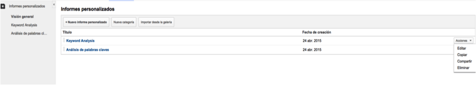
Once the report has been created, if we want to view it we only have to go to customization and select it. In addition, from this panel we can edit, copy, share and even delete the report as shown in the following images:
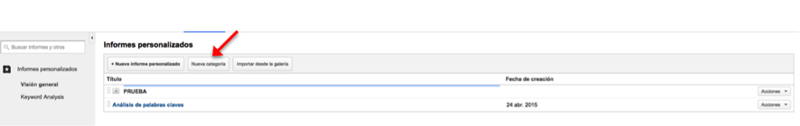
If, on the other hand, what we want is to create a folder and save the reports in it, click on new category and proceed to create it.
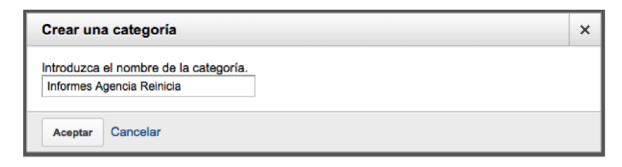
A window will open and we will introduce the name with which we want to define this folder, click on Accept.
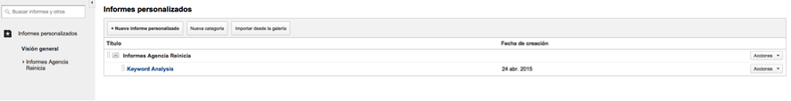
If we then want the report to be saved in that category by simply moving it, we will have included it.
How to share your customized reports
Once we have finished our report, Google Analytics gives us the possibility to share it with our clients, a highly recommended option to speed up our work.
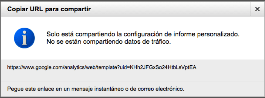
Keep in mind that when we decide to share our report, we only share the structure of our report and not the data. Here is an example for you to understand it much faster.
Example: the SEO department has created a report and shared it with their colleagues in the web analytics department, if the SEO department then makes changes the link they shared will continue to show the first version of the report, so if they want them to see the latest changes they will have to share it again so that the web analytics department can see it.
To share, we do it from the custom reports overview and select the share option as shown in the following image.
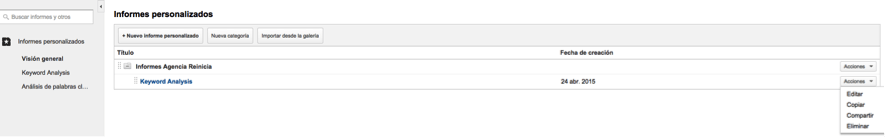
Select share
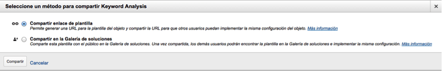
In our case we choose the option to share template link, with this option what we do is generate a URL that we will share with those users that we want to implement the same report configuration in their Google Analytics account. We click on Share.
This window will appear in which it provides us with a url that we copy and we can send it via email to the people we deem appropriate to share the report.
When the person to whom we have sent the report opens the link, they will be asked for the profile into which they want to import the customized report, advanced segment or dashboard and a name. From the moment of the import they will be able to see the report, dashboard or apply the advanced segment that we have shared.