Our appointment with the best websites of 2015 is back. The year is not over yet, but we can already draw some conclusions about the most interesting websites of this year.
They are not the best websites of the year, but they are websites that for us stand out in some fields of design and development and we will surely apply some ideas to future web projects. Several aspects that many of them share:
- Interactivity as an element of entertainment and improvement of the navigation experience.
- Visual content: images, animations and videos.
- Music [with the possibility of disconnecting it generally].
- Spectacular transitions and mix of different navigations: vertical and horizontal.
Histography
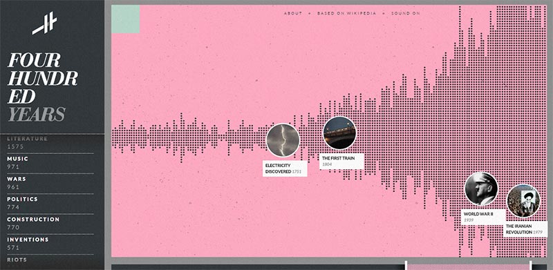
The first site in our ranking is a wonderful data visualization. Histography visualizes all the events of our universe and the history of mankind in a brilliant interactive infographic. The result is staggering, it is impressive to see how a huge mass of data can be so descriptive and how chaos can be harmonious. The events are generated and updated directly through the Wikipedia API.
All in all Histography is an impressive example of how big data can take a shape and feel and maintain an easy and intuitive navigation through a mix of elements such as the sidebar by categories, the bottom panel pop-up by specific periods and the time bar to narrow down the events by dates. Certainly ideas that could easily be applied to other sites.
Species in pieces
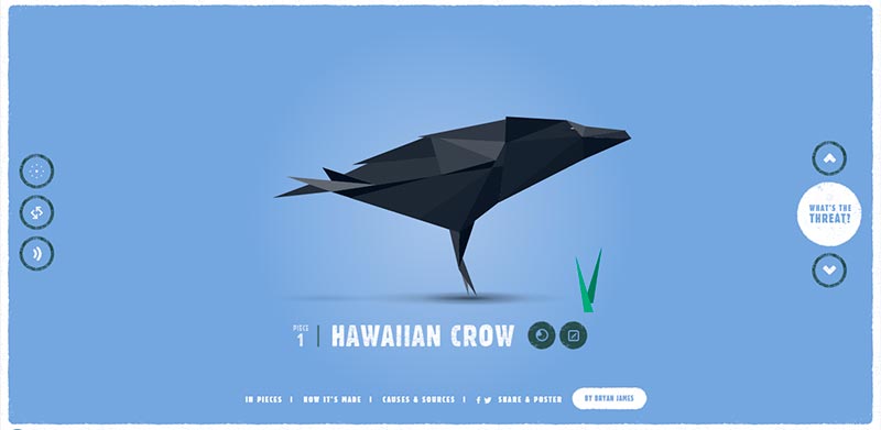
We now move on to another site worthy of attention. “Species in pieces” is a microsite that wants to raise awareness about the terrible problem of the extinction of wildlife in recent decades. Also here there is data representation, but what has caught our attention is the beauty of the representation of species made as if it were a sum of fractals delicately united and in equally fragile in disintegrating like a porcelain doll when interacting and moving from one type of information to another.
Of course, we also highlight the UI of this website: simple and intuitive, with smooth, fast and very beautiful.
Jam3
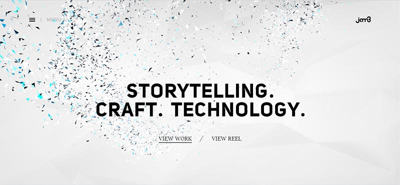
This is the year of fractals. This website also opens with a very elegant game of polygons. It is a game that hypnotizes us: the cursor creates and destroys shapes, the experience is memorable. This is a presentation website of a web design agency, nothing more and nothing less, but the artistic imprint of the studio is clear to us. We notice for example the almost complete absence of colors and observe the combination of typography. Jam3 takes the web design trends of recent years and makes them their own.
It is a site where we are invited to play to create our own experience. Images and videos are the protagonists of this site, where the navigation menu has been hidden behind a hamburger icon to give more importance if possible to these elements and where transitions are the undisputed queens of this browsing experience.
BBQ Cultures
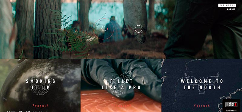
We have been undecided whether or not to include this website in the article: in the studio there are some green lovers, but this website about the art of “bbq” has left us speechless =P
Videos are undoubtedly a trend. BBQ Cultures teaches us how to promote a product in a strategic way, offering potential customers a fun, educational and interesting content for them, without being boring. Video is an element that has always worked well in advertising and is becoming more and more important on the Internet. Or could there be a better way to reflect situations that each of us may have experienced around a barbecue with friends or family?
But it is not only the videos, but also the subdivision of the screen, the typographic games and the texts that contribute to create a memorable experience.
Now we just have to wait for them to make a similar one with vegetables!
Dropbox User Guide
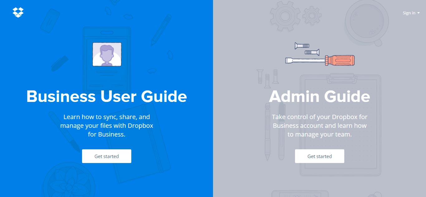
Last but not least, the Dropbox user guide. Who doesn’t use this magnificent tool by now? We already know how Dropbox has transformed a repetitive and sometimes frustrating activity like data storage and retrieval into a unique user experience. This year they have managed to improve so much the user guide in such a good way that it almost seems fun to read it, skillfully mixing quick transitions from one section of the guide to another and horizontal and vertical navigations that make the reading progress more pleasant.
The UI of this website should be in the school books: intuitive, simple, very fast loading and a lot of personality. Go Dropbox.
Have you seen any websites published this year that you would like to point out to us? Don’t be shy and comment below.