On many occasions we come across situations of clients who have very good results with their desktop websites, but who nevertheless barely manage to take off in their mobile versions. A quick glance is enough to see that the mobile web has been set up from the wrong point of view and that the user experience is really poor. This is why it is necessary to rethink these versions from scratch to provide them with optimal usability.
Paradigm shift
In order to talk about usability in mobile webs, it is essential to first talk about certain paradigms that have become essential to follow in order to make a good design, not for aesthetics, but because they facilitate the creation of user experiences that really work.
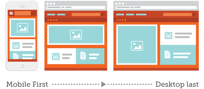
Mobile First
Starting the design of a website from its smallest version, in which you can include a limited number of elements, will help you separate the wheat from the chaff and focus on what the user needs to be shown on the screen. Everything else is secondary and will either only need to be shown in the desktop version or will need to be removed from the web.
To fit the content correctly, without the user having to do an infinite “scroll” or have high waiting times, you can use features such as hidden content in accordions that when clicking on them are displayed or loaded by Ajax as you scroll:

2. Focus on showing the content
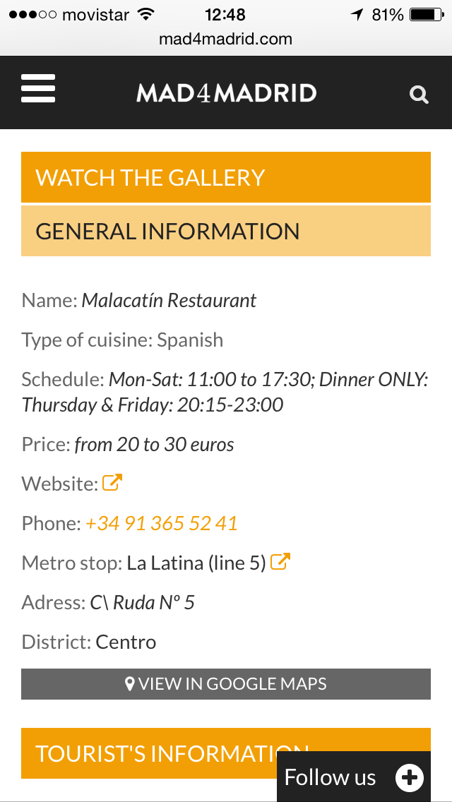
Lorem Ípsum is dead! In our work methodology for web design and development, the first thing we ask our clients to do is to send us a part of the content they want to show on the web. In this way, we adapt the continent to the content and not the other way around. On mobile, this is even more relevant, since many design elements and graphic resources will disappear from the screen and practically 80% will be content.
The ideal for us is that before starting the design and development, the customer has provided us with enough information to assemble the “Minimum Viable Product” with which to work. But don’t worry, because these contents can be changed during the different iterations of the project, it is not something closed, far from it.
3. Stay true to the Business Objectives
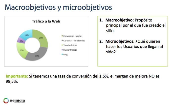
In order to determine what is a priority on each page of your website, it is essential to be clear about the business objectives you are pursuing and, from there, to determine which objective each page is focused on. And we are not only referring to the macro-objective, but also to the micro-objectives such as user registrations, downloads, customer service or visits to certain sections of the website. 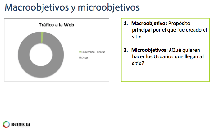
Usability factors to take into account
Now that we have given you a clear starting point for mobile web design, we will briefly explain 10 very important factors to take into account when it comes to getting down to work:
- Calls To Actions [Call To Actions].
They must be clearly visible
- Sufficient size to be able to click and see them. Minimum 7mm width and height
- With sufficient separation from the rest of the elements, so that when trying to click on them, visitors do not make a mistake.
- With a correct hierarchy of colors, that is to say, that allows to see it well over the rest of the contents.
- Font size
Ensure that the font size is appropriate and that the user will NOT have to zoom in and out.
- 16px CSS recommended, adapting according to screen size and resolution
- Take into account the size of the font used
- Uses sizes in relation to the base size, i.e., em
- Sufficient spacing. Google recommends 1.2em
- Do not use too many fonts, it confuses and overloads the content.
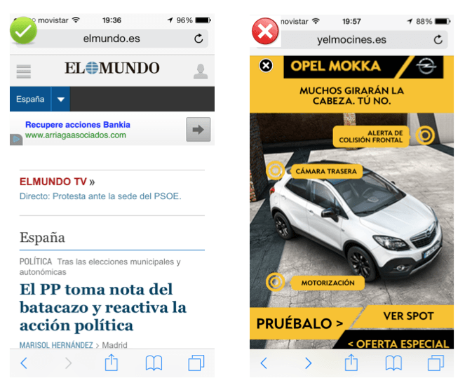
- Advertising formats
- Do not use advertising formats that make navigation difficult, such as interstitials.
- Avoid above all formats with small blades or windows that cover the entire screen or more: Interstitials replace them with banners.
- Avoid desktop version modal windows when browsing from mobile devices. There are applications that allow you to control this.
- Banners are a better fit, although there are other typologies such as sponsored articles or advertising that is content in itself, which fits better with the mobile paradigm.
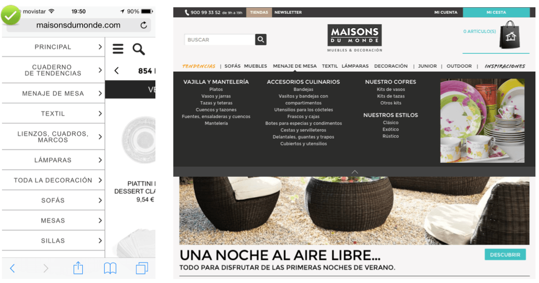
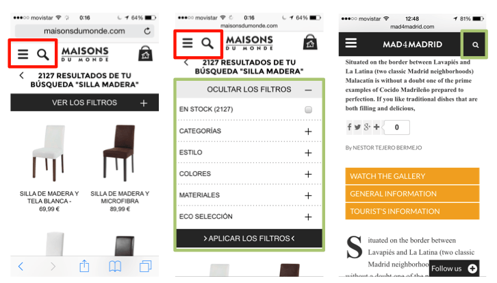
- Navigation menus
- Keep the menus as short as possible. It is likely that the menu of the mobile version will have to be different from the desktop version. You will have to ask yourself what is really important.
- Change the order of the elements if necessary.
- Use of dropdowns and checkboxes for multiple selections. Be careful with the size and distance between boxes so that the visitor does not get confused when clicking on them.
- Navigation aids
- Indicate which orientation works best. Generally, the user does not change the orientation unless they cannot perform a web task well, such as viewing an image that is horizontal instead of vertical.
- Facilitate the return to the Home page. The user may want to go back to start the navigation from scratch. It is standard navigation to click on the logo and be taken to the home page.
- Keep Users in the same window. Switching windows in the mobile browser can be cumbersome and makes it difficult for users to find their way back.
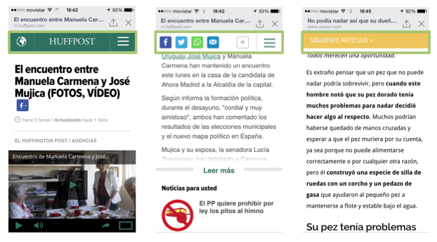
- Search tool
- Keep the search tool clearly visible
- Keep at the top whenever possible and make it the minimum size advisable as explained above. If this is not possible, separate it well from other tactile elements, otherwise the visitor could make a mistake when clicking.
- It is normal that when scrolling down, the top bar is always present with the brand name, the navigation menu and the search tool.
- Enable functionalities such as result categorization and autocomplete and in the results show what is really relevant to users.
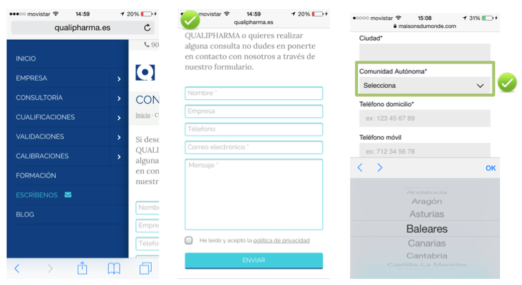
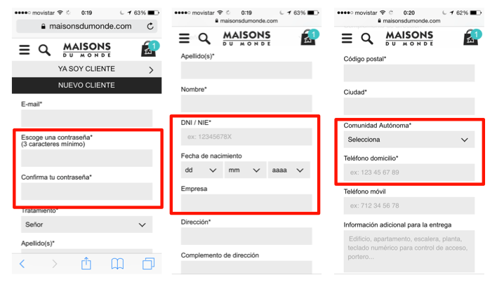
- Forms
- Use existing data whenever available. For example, already registered users, pre-fill fields and ask for confirmation or use GPS location data whenever the user allows it.
- Forms as short as possible. Essential information.
- Avoid using the device’s keyboard, which generally has keys that are too small and can mislead visitors to our website.
- Use drop-down menus whenever possible.
- Select the most appropriate data entry mode in each case.
- Validations in real time, using javascript, instead of waiting to send to get a response from the server. This will avoid unnecessary waiting times for server response.
- Ordering process
- Allow guest checkout. Forcing registration is adding steps that need not be necessary. You can get the user to register voluntarily once the order has been placed or to subscribe to the newsletter.
- First ask for the e-mail address to be able to follow the track and on the next screen, the rest of the data.
- Enable telephone help CTAs during the process. A telephone is very useful and avoids abandonment of the process due to possible doubts or unexpected outages.
- Allow to convert to other devices. Put a button to resend the product or order and continue it at another time or enable “add to favorites / wishlists”.
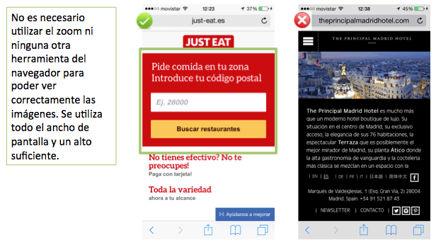
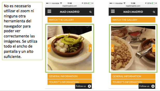
- Images
- NOT display images that require zooming or other browser resources to view on first load.
- Enable enlargement and viewing of detailed and higher resolution photos
- Avoid unnecessary uploading of photographs. Limit the number in the mobile versions.
- Web Home
- Calls to action in a prominent place, if possible at the top of the screen and centered
- The visitor will scroll to find the content, but if he/she doesn’t find it quickly, he/she will leave.
- Avoid loading unnecessary content. Limit loading on mobile versions